 Phillip Dodson
Using Segmentation to Improve Sponsorships & Activations
 Ron Reisman: Apr 4, 2024 5:16:41 PM
What do you think of when you hear the phrase “diverse sponsorships?”

The times are a-changin’ in web development. Back in the day (a couple of years ago), a single web page was thought of as, and designed to be, the purveyor of information. The page was a single unit, with many elements such as headers, navigation, images, footers, among other things. The world was grand, until The Proliferation of Every Device, Ever.
Suddenly, more devices were viewing our pages. Things like BlackBerrys (remember PDAs?) were able to browse the web followed by smart phones then tablets. We are now in the Internet of Things where smart tvs, gaming consoles, wearables, refrigerators, and more are connected to the web.
With the explosion of mobile apps and social media, content is consumed at a higher rate and in different contexts. Users are viewing smaller chunks of content, microcontent, on Facebook and Twitter feeds, apps, and push notifications. The web “page” is now an aggregate of information instead of a single unit; a feed of related content.
The web page is still an important delivery method, however. Responsive web design (RWD) came about as a solution to the near-limitless screen size variations and allows developers to resize and reflow UI elements and content. RWD revolves around a CSS grouping called the media query, which, well, queries the viewer’s media (the output device). For example, if a screen is wider than 600 pixels, a developer could tell the images to be smaller, or on a wider screen, footer content can become a sidebar. This flexibility insures that content can be accessible on all screen sizes. Unfortunately, this same flexibility adds complexity and can often lead to unmaintainable, buggy, and bloated code unless there are organizational systems in place.
BEM, which stands for Blocks, Elements, and Modifiers, is one of many methodologies developed that address the idea of having blocks of elements. BEM defines bits of a user interface (UI) as independent, reusable blocks. Blocks have zero or more elements, and each block or element can have a modifier. A block can be anything: a content feed, a single piece of content, a contact form, a header search field, anything. Here is a visual representation of what I’m talking about.
To better illustrate blocks, elements, and modifiers, let’s identify potential blocks and elements on a YouTube video page.
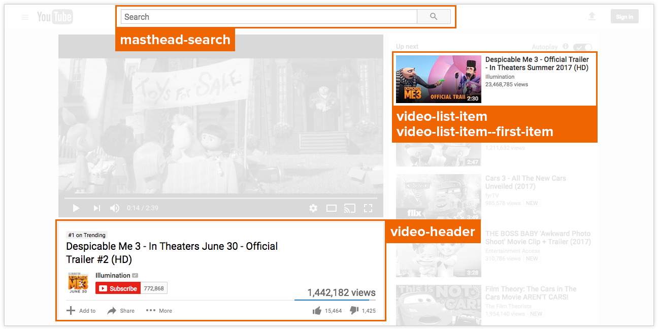 Using YouTube as an example, here are some potential blocks identified. Notice the video-list-item block has a modifier, --first-item.
Starting with blocks, there are a few that stand out. The masthead-search and video-header blocks appear once on this page. The video-list-item is a block that repeats for each video in the sidebar. I’ve added a modifier to the first one to allow for different styling.
The next image identifies potential elements within the video-header block.
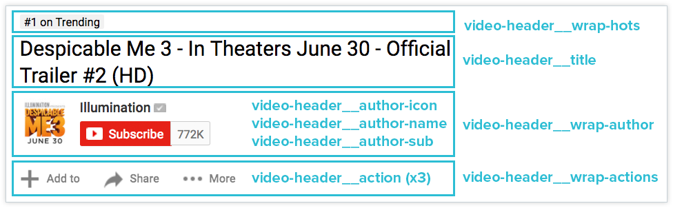 Breaking down the video-header block into potential elements. I’ve removed some elements for clarity. Note that some elements appear inside of other elements.
CSS
.block {};
.block__element {};
.block--modifier {};
.block__element--modifier {};
HTML
<!-- a block with two elements, one has a modifier -->
<div class="block">
  <div class="block__element"></div>
  <div class="block__element block__element--modifier"></div>
</div>

<!-- a block with a modifier that contains one element -->
<div class="block block--modifier">
  <div class="block__element"></div>
</div>
The above example defines an abstract block .block that has an element identified by double-underscores .block__element. The block also defines a modifier identified by double-hyphens .block--modifier. Additionally, .block__element also defines a modifier .block__element--modifier.
Before coding a custom example, I’d like to point out that I’ve adopted Harry Roberts’ posts on naming convention and namespacing. The naming convention states that elements are preceded with the double-underscore and modifiers are preceded with double-hyphens. I’ll talk more about namespaces in a follow-up post.
CSS
.c-bio {
  background-color: #eee;
  border: 1px solid #ddd;
  border-radius: 5px;
  padding: 1em;
  font-family: sans-serif;
}

.c-bio--latest {
  background-color: #333;
  color: white;
}

.c-bio__name {
  font-size: 2em;
}

.c-bio__excerpt {
  border-top: 1px solid #ddd;
  margin-top: .5em;
  padding-top: .5em;
}
HTML
<div class="c-bio c-bio--latest">
  <div class="c-bio__name">Phillip Dodson</div>
  <div class="c-bio__excerpt">I heart hamburgers.</div>
</div>

<div class="c-bio">
  <div class="c-bio__name">Dustin Woehrmann</div>
  <div class="c-bio__excerpt">I heart Grace (woof).</div>
</div>
Above are two author bio block COMPONENTS, denoted with the c- namespace. Each component has the name and excerpt elements and the first bio is the latest as evidenced by the --latest modifier. The benefit of using BEM is that the code is self-documenting. Another developer could quickly glance at this code to get a sense of what’s going on and make adjustments without worrying about breaking something unrelated.
The above example is intentionally trivial because I wanted to quickly convey the idea. It’s an example you’d see on any blocks, elements, and modifyers introduction. In practice, however, there are situations that arise which trivial examples do not answer. When I was first learning this, I often felt uncertain and frustrated because these basic examples do not address complex situations.
For the next iterations, I will give tutorials that demonstrate my own growing pains and how I solve them in more complex applications.
Until next time!

 Ron Reisman: Apr 4, 2024 5:16:41 PM
What do you think of when you hear the phrase “diverse sponsorships?”

 Steven Cortese: Mar 14, 2024 7:52:57 AM
Come June,we can expect to see the usual suspects up in arms about brands engaging in (or even supporting) LGBTQ+ Pride campaigns. Of course, not...
 Rich Preffer: Mar 1, 2024 3:02:50 PM
First things first: what is a podcast?