 Boombox Team
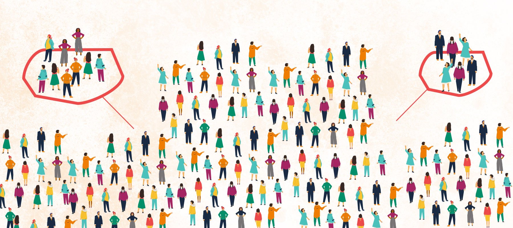
Using Segmentation to Improve Sponsorships & Activations
What do you think of when you hear the phrase “diverse sponsorships?”

Logos, unlike Hollywood’s elite, can’t get botox when they start looking old and haggard. They need to be completely reinvented and reimagined with the brand’s future trajectory in mind. But the real question is how do you tell your boss – or, if you are the boss, how do you tell yourself – that the precious logo developed decades ago needs a little nip n’ tuck? Tact.
I mean, let’s be real for a moment, no one wants to hear that their logo is looking like Ms. Habersham. Yet coming to this realization just might be the thing that pushes the brand forward into the future. If you're looking to tell you boss that it's time for a refresh, do it with some real information to back you up.
Look at the logos of your competitors and compare yours to theirs. Based on the look of their logo, would potential customers be more intrigued by you or them? Look at other logos you admire and show how some logos - even those developed years ago - have withstood the test of time and demonstrate why. Take Nike’s logo, for example, it’s a simple swoosh, and yet, through the years that single icon hasn’t even needed words next to it - you just know it’s Nike. Even Coca-Cola, which uses a classic font as its iconic mark, does the same thing. In fact, you could write any sentence in the Coca-Cola font and immediately know it was from Coke without ever having to say the words “Coca-Cola”.
 (Photo by Mika Baumeister on Unsplash)
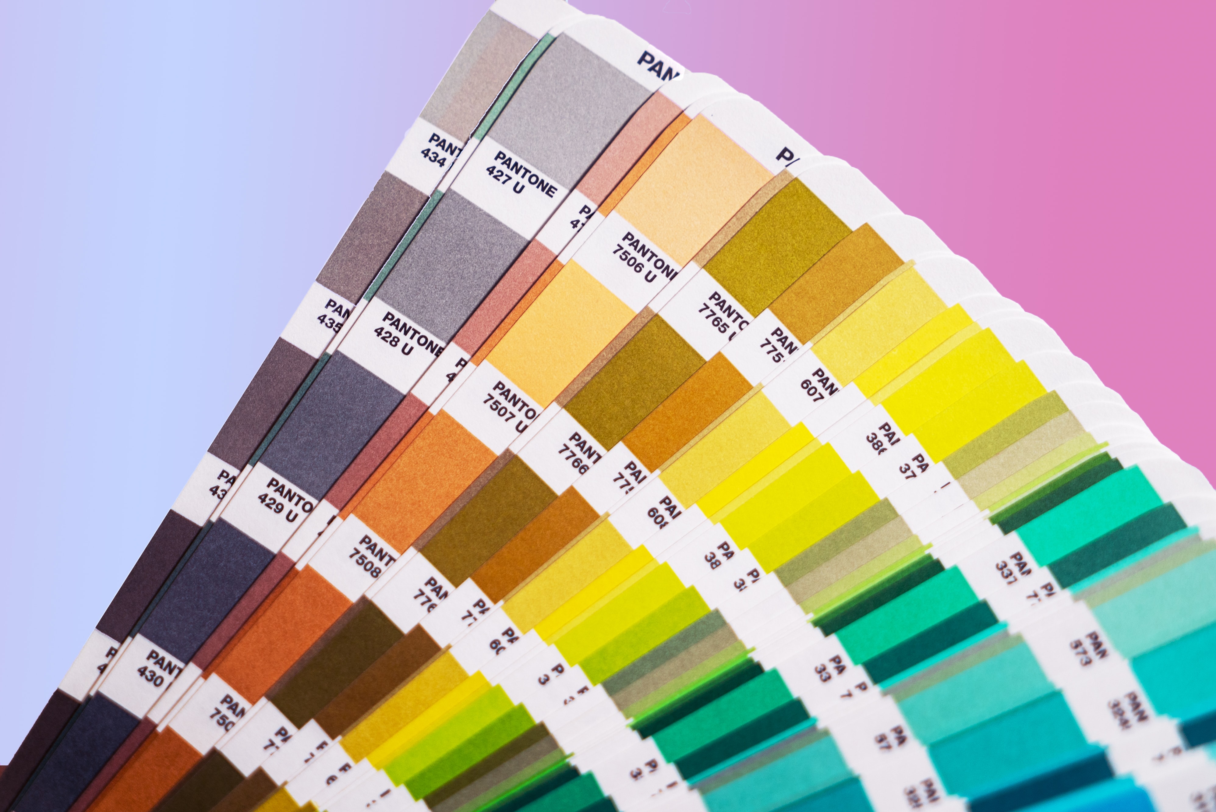
Consider updating your colors if you haven’t revised them in a long time. Now, I’m not suggesting you update your colors every year, but if you’re thinking about it check out Pantone’s yearly color palette and their recommended color of the year. Sometimes updating your logo can be as simple as updating your color palette to more modern colors.
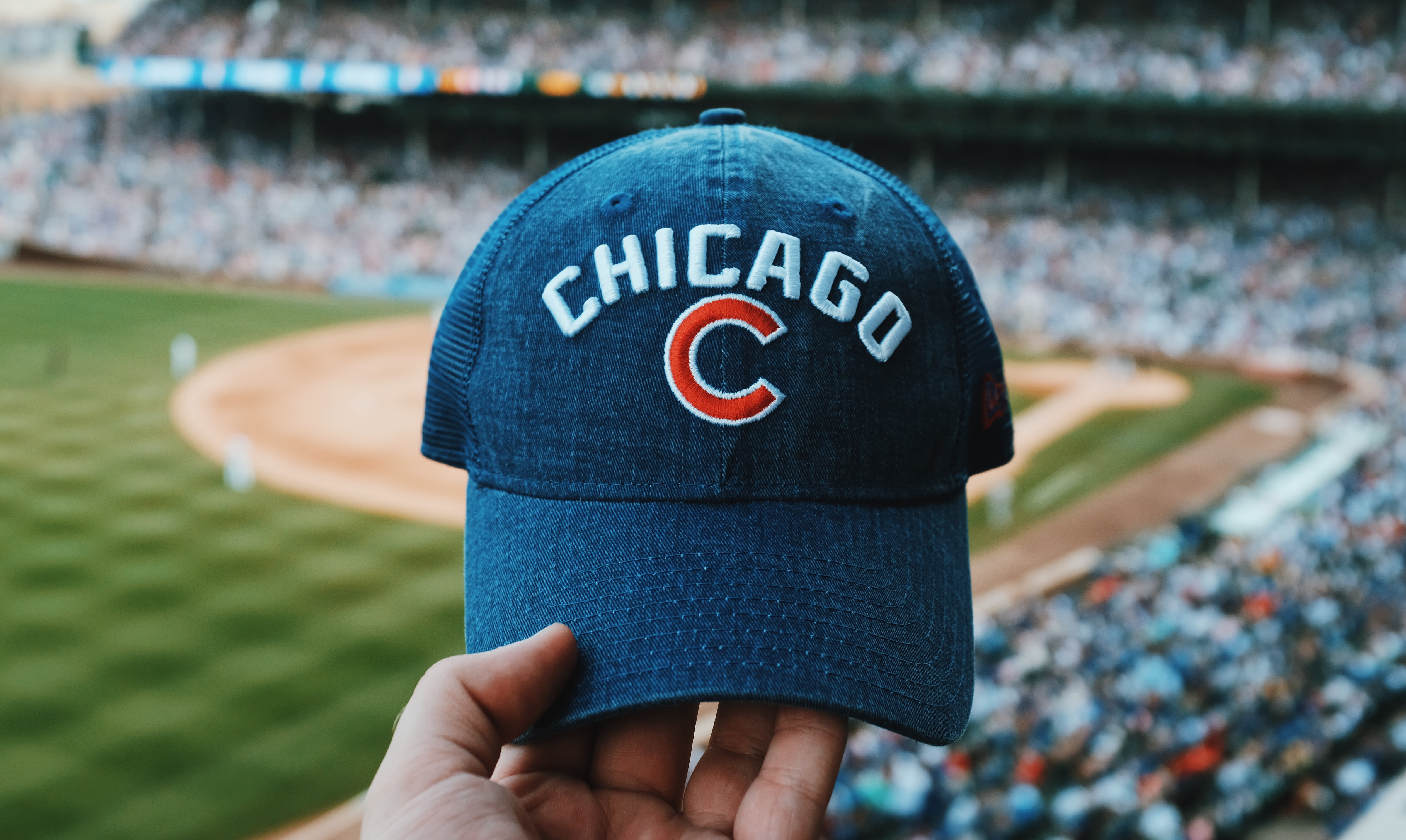
If you wouldn’t want to wear your logo on a t-shirt or on a hat, that’s a tell-tale sign that you need a new logo. If your logo looks busy on a hat or a t-shirt, that’s also a sign you need a new logo. And if your logo is so complex that it would be virtually impossible to have it embroidered on a hat – you guessed it – you need a new logo.
 (Photo by Blake Guidry on Unsplash)
If your current logo uses multiple fonts, has more than two colors, or doesn’t work when shrunk down to a 1-inch x 1-inch size, it’s time to re-do your logo. In our experience, logos that have multiple fonts and colors can feel cluttered. Another thing that can clutter up a logo is multiple graphic elements within the logo itself.
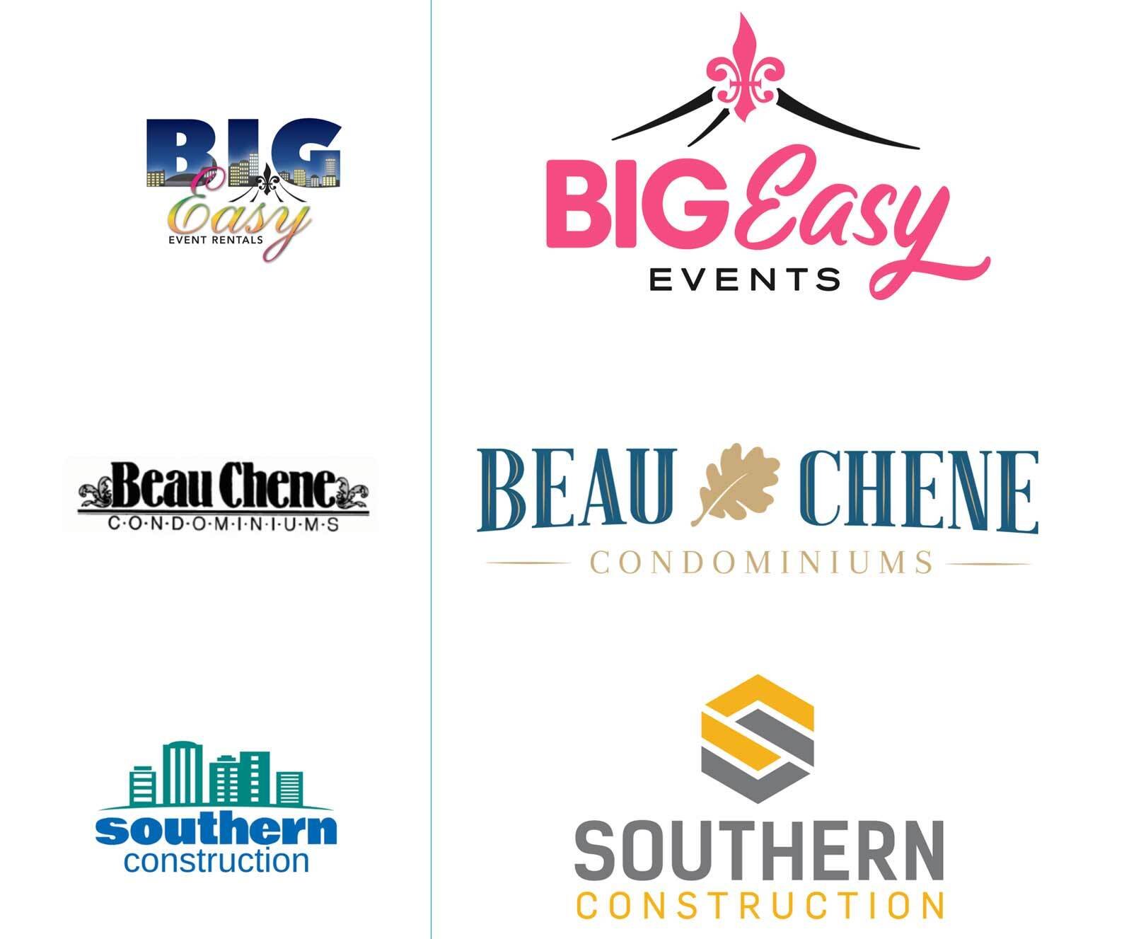
Below are a few examples of logos we’ve redesigned. You can tell the difference right away. They feel more modern, more professional, and just cooler.
Are you feeling like your logo might need a little nip-n-tuck? We can help. Our graphic designers are pros at helping brands determine when their logos need to be reinvented or when they need to be scrapped altogether and started from scratch. Interested? Click on the link below. 
What do you think of when you hear the phrase “diverse sponsorships?”
Come June,we can expect to see the usual suspects up in arms about brands engaging in (or even supporting) LGBTQ+ Pride campaigns. Of course, not...
First things first: what is a podcast?